

_edited.png)
_edited.png)
Music fans all over the world wants to attend their favorite artist or band concert once in their lifetime. Imagine getting an opportunity to attend your dream concert which you have been waiting for long time and first step is to book tickets, However, the reality of concert ticket booking is? STRESSFUL.
These are some of the problems that cause stress for concertgoers while booking tickets with current concert ticket booking systems.
-
Confusing Interface & Seat Selection: Struggle to find the perfect seat due to confusing interface causing frustration.
-
High-Demand Anxiety: This leaves users unsure of their position and fears of missing out on high-demand tickets.
-
Hidden Fees & Limited Merchandise Access: Unclear pricing structures and limited access to merchandise can leave fans feeling misled and frustrated.
-
Lack of personalization: Generic recommendations with no option for individual tastes, hinder the excitement of concert discovery.
as a result...
These gaps lead to abandon tickets before purchase
SOLUTION
This is why I designed CONTICK, a concert ticket booking application that transforms the concert ticketing journey, making it smooth, personalized, and joyful.
My Role
Solo project
Tools
Figma
Timeline
Nov 2021 - Feb 2022 (3 months)
Let's see how CONTICK solves the problems that users face:
AI-powered Dynamic Seat Recommendations
-
Solves Confusing Interface & Seat Selection, as AI will simplify the selection process based on user preferences.
-
See your seat before you buy, ensuring the perfect location for your preferences.
-
Tailor your experience by selecting seats based on specific
needs like accessibility or unobstructed views.
-
Create lasting memories with a seat that perfectly captures the energy and atmosphere of the concert.
_edited.png)

_edited.png)
_edited.png)

Virtual Waiting Room
-
Solves high-demand anxiety by not creating a frustrating experience for users, leaving them unsure of their seat selection.
-
Experience a smooth and reliable purchase process, even during high-demand events.
-
Wait in a queue with a clear and transparent system. No more worrying about unfair access or missing chance to get tickets.
-
Get real-time updates on your position in line and your estimated wait time.
In-App Order Merchandise
-
This solves hidden fee issues & lack of personalization: fee breakdown within the merchandise and ticket purchase flow. This displays the exact price of each item, including any applicable taxes or service charges, before checkout. This transparency helps users avoid surprises and builds trust.
-
Browse exclusive merchandise without leaving the app. No more waiting in long lines or missing out on popular items.
-
Pre-order your favorite merchandise before the concert and guarantee it's waiting for you upon arrival.
_edited.png)
How did I reach to create these features?
RESEARCH APPROACH
From here I started my research journey aiming to understand their pain points and frustrations while using current systems on a deeper level. I iterated these research processes many times before arriving at a solution and also to identify opportunities to improve CONTICK to create a more user-friendly one. This is the journey before arriving at the solution.
01
Research
Surveys
User interview
Secondary research
02
Design
Wireframes
Hi-Fi design
03
Evaluate
Usability testing
Design iterations
Interactive prototype
Competitive analysis
Affinity mapping
Personas
SURVEYS
In need of different solution
My research journey began with surveys. I created some multiple-choice and open-ended questions to gather user feedback on their experiences with concert platforms, and many expressed frustrations like (confusing interfaces/hidden fees/lack of engagement) and many more indicating a desire for a more personalized and transparent concert experience.
I found these 3 as major requirements from survey,
Desire Personalization
Need Transparency
Proper Interface
Most of the users crave for personalized recommendations and features based on their individual preferences.
Users desire clear pricing, transparent fees, and easy access to relevant information, as they don't want to be bombarded with irrelevant info's.
They find current interfaces confusing and difficult to navigate, seeking a more user-friendly experience.
USER INTERVIEW
Users crave a more engaging and personalized booking experience.
After survey I conducted semi-structured user interviews as I wanted to talk to users to have better understanding about their thoughts, feelings, and experiences regarding concert platforms which helps a lot in getting to know them personally.
Interview mode
Virtual interview
Length
30 - 40 minutes
Partcipiants
10 participants
(2 disabled users)
Target audience
18 - 50
The goal was to understand:
1. Perceptions of current concert platforms
2. Dream concert experience
3. Personalization preferences
4. Engagement beyond ticketing
SOME OF THE THE INTERVIEW QUESTIONS ARE:
1. Describe your dream concert experience from start to finish. What elements would make it feel truly smooth
and enjoyable, from ticket purchase to the end of the show?
2. Imagine a platform that could personalize your entire pre-concert journey beyond just buying tickets, what features would you find most helpful and exciting?
3. Beyond attending the concert itself, how would you like to feel connected to the artist and other fans before,during, and after the event?
4. What factors would make you feel completely confident and informed throughout the ticket purchase process and concert experience?
5. If you could design the future of concert ticketing, what features or functionalities would you prioritize?
Some user comments,
_edited.jpg)

SECONDARY RESEARCH
Validates user frustrations, highlighting areas for improvement
I also wanted to know whether there are any articles or blogs that mentions about the current systems issue so I started research to backup my primary research, and also to get more clarity on current systems functionalities and their feedbacks or issues, this helps to understand the user requirements in more empathetic way. Some of the data are collected from Downdetector, Lifewire, Medium.


_ed.jpg)
COMPETITIVE ANALYSIS
Competitors lack focus on user-centric features and technological advancements.
While keeping the above things in mind, I looked into the market to find my competitors and also users that using currently to book tickets and found four major players. I found that these existing platforms primarily focus on traditional ticketing functionalities, leaving room for solution to differentiate itself from this aspect.


Final insights from the research methodologies
From all the research methodologies I conducted, I generated the following insights and grouped them into similar categories to identify key user needs and opportunities for improvement. This helped me to have clear understanding of the core problems and how Contick can address them.
DESIGN
Mobile app or Website or Both ?
With research findings in mind I started design phase so when I first started designing this, I was totally stumped about what platform to use. Website? App? Both? It felt like a huge decision. But then I took a step back and did some research, thought about the lifestyle of concertgoers, they're always on the go, juggling busy schedules, and spontaneous plans often rule the day.
After all this platform decision was made,
Platform decision : "MOBILE APPS" are key drivers...
according to "Technavio"
Users demands seamless and immersive experience. That's why I prioritizing a mobile app, and research also revealed that mobile users can have smoother interactions, and optimized usability with preferring mobile ticketing. It puts everything users need right at their fingertips - finding events, grabbing tickets on the go.
Additionally, a mobile app offers exciting possibilities for personalization. For example, features like location-based notifications or customized recommendations based on past purchases can address user frustrations identified in research insight Group 1: Lack of Individuality.

USABILITY TESTING
ROUND 1 - Addition of new design goal "Engagement"
After prioritizing a mobile app for its convenience and user preference. I started designing and conducted the first round of usability testing with 10 concertgoers. The goal was to evaluate the user experience for concert discovery and ticketing, ensuring a smooth and user-centric journey. The unmoderated remote testing allowed users to interact with the prototype on their personal devices, simulating real-world scenarios.
The results were encouraging:
Users loved the personalized AI seat recommendations and in-app merchandise option, as they found it convenience and time-saving. These findings were reassuring, as both features are central to Contick's mission of streamlining the concert experience.
However, the testing also revealed an SURPRISE! user need:
"Engagement" is also necessary!
Though many users loved virtual waiting room stating it was clear and informative, but most of them said they want more during the wait. They shared that they wanted to connect with other fans, share their excitement, and build the pre-concert buzz.
This led to the idea of adding live chat, this allows users to chat with other fans in line, share their anticipation, and maybe even make new friends before the concert even begins, fostering a sense of community and excitement amongst concertgoers.
3 Major improvements:


Chatroom while waiting
1. Users wanted to share excitement, ask questions, and build community before the event.
2. Users can now send text messages, engage in conversations, and build connections with fellow attendees, making the waiting room more interactive.
"WOW! waiting room looks good but it would be better if I get a chance to speak with other fans so I'll be excited and maybe even can make some new friends".
User quote for previous design:
BEFORE
AFTER
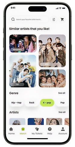
Merchandise in Artist Profile
1. Initial functionality showcased artist bios and upcoming concert listings.
2. Users desired the ability to purchase merchandise directly from the artist profile.
User quote for previous design:
"It will be awesome if I can directly buy merch from artist bio page that I like in homepage itself, as I can avoid going to merch section, search artist and then buy"

BEFORE

AFTER


Eliminate pop-up
1. Initial design utilized a pop-up window to offer the option of AI-assisted seat selection.
2. Based on user feedback, integrated the AI-assisted seat selection option directly below the seat map, for a seamless experience without the interruption of a pop-up window.
User quote for previous design:
"It is not good every time if I want to select seat then I need to select yes/no option"
BEFORE
AFTER
HIGH FIDELITY DESIGN
Next, I created high-fidelity designs based on the feedback I received from usability testing round 1, I iteratively refined the designs as my primary goal is to to ensure an intuitive and user-friendly experience.
Accessibility consideration
1. Contick is designed for everyone and uses color combinations that are easy to read for people with all vision abilities. For example, black text on a white background has a 21.1:1 contrast ratio, and black text on a #cdf563 background maintains a strong 16.83:1 ratio. These values far exceed WCAG recommendations.
2. Offers larger font size options and high-contrast text and background combinations to ensure a comfortable experience for users with low vision.

HIGH FIDELITY DESIGN
Personalization Process


USABILITY TESTING
ROUND 2 - Positive Feedback
After completing high fidelity designs I conducted a 2nd round of usability testing with approximately 15 concertgoers. This remote testing session followed a structured approach:
1. I introduced the project goal and functionalities.
2. Presented participants with a scenario for successful accomplisment.
3. Carefully observing their interactions and collecting their feedback.
SOME USER QUOTES:
"Virtual waiting room is fun and made the ticket purchase process feel less stressful. I think I'm gonna use Contick if it comes in in future!"
"The new discovery artist feature helped me find concerts I didn't know existed! as I like to explore different artists."
"WOW! I wanted merchandise section while booking tickets so bad, now I got it! so buying merchs along with tickets makes process so much smoother!"
METRICS
While Contick is currently a prototype, its design choices pave the way for significant improvements in user engagement, retention, and overall satisfaction. Here's how it could potentially impact these metrics:
1. Increase in the user engagement rate through improved functionalities and personalized recommendations.
2. Reduction in cart abandonment, potentially leading to increased user retention.
3. Reduction in perceived waiting time, leading to increased user satisfaction and potential retention.
Prototype
This is the latest prototype with all the updated changes. Further changes can be added based on more user feedbacks.
REFLECTION
Improvements that can be done,
-
Exploring the Potential of AR/VR: While ticket booking currently functions well in the 2D space, exploring the potential of AR/VR could be fascinating for future iterations. Imagine users virtually walking through concert venues or visualizing merchandise in AR before purchase! This could create a truly immersive and engaging experience, though it might require careful consideration of technical feasibility and user needs.
-
Gamified Waiting Room: The virtual waiting room offers a transparent queue system with estimated wait times. We can implement a lightweight gamification system within the waiting room. Users could earn points for patiently waiting or completing short quizzes about the artist/event. These points could be redeemed for discounts on merchandise or future ticket purchases.
-
Quantitative Data Matters: While qualitative data like user quotes are helpful, collecting more quantitative data through surveys or A/B testing would provide a more measurable understanding of the impact of my design choices. Numbers can provide a clearer picture of how your design decisions translate to user behavior.