
Solution Catalogue
Transformed the website into a user-friendly platform that showcases our projects, making it easier to engage clients and drive new business.


Team
2 UX designers
2 Developer
1 Business analyst
My Role
Research and analysis
Visual design
Product strategy
Timeline
Oct - Dec 2023 (2 months)
INTRODUCTION
What is a Solution Catalogue? Why is it needed?
The Solution Catalogue is a centralized platform that showcases the projects designed and developed by our _VOIS India team.
The Solution Catalogue is key to acquiring new projects, It allows Business Analysts (BAs) to quickly find and present the right projects to clients based on their needs. By demonstrating how these projects work and their benefits, the catalogue helps to build client relationships, earn their trust, and secure more business.
How I Got Involved
The original Solution Catalogue was designed entirely within SharePoint, and the client wanted the redesign to follow this structure, avoiding a fully custom design. However, after several discussions and back-and-forths, the client eventually agreed to design the internal pages within SharePoint, while the homepage could incorporate a few custom design elements to give it a fresh, modern look. After the final decision in October 2023, I was tasked with leading the redesign of this website.
PROBLEM BREAKDOWN
So what are the "problems"?
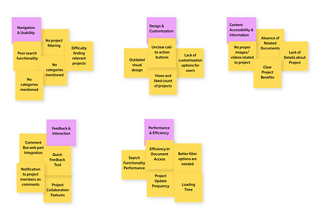
When I first started digging into the Solution Catalogue, it became clear that there were a few major issues holding it back from being truly effective. Through a combination of user feedback, analytics, and stakeholder interviews, we identified the main user experience issues affecting the Solution Catalogue. These problems were weighted based on their impact on both user experience and business objectives Here's what I found:
Outdated Design & Lack of customization
The interface was not visually appealing and didn't reflect the quality of our work and no easy way to tailor the catalogue to specific client needs.
Poor Navigation
Clients and stakeholders struggled to find relevant projects quickly, leading to frustration and missed opportunities.
Lack of Engagement
The catalogue failed to capture and maintain the interest of users with no detailed information about the project, making it difficult for BAs to showcase our work effectively.
PRODUCT GOAL
As we got to know that the existing Solution Catalogue was no longer meeting the needs of our team or our clients. It was time to rethink its structure and usability to better serve our goals. So the product goal was to,
"Transform the Solution Catalogue into an interactive platform that makes it easy for both BAs and clients to navigate and find the right solutions".
RESEARCH & ANALYSIS
We reviewed user feedback, conducted interviews with BAs and clients, also analyzed how stakeholders interacted with the existing Solution Catalogue.
-
Conducted interviews with 5 Business Analysts (BAs) who regularly interacted with the Solution Catalogue
BA Quote:
“I often struggle to find the right project quickly. It’s frustrating when I’m in a meeting and can’t pull up what I need without digging through irrelevant results.”
-
We reviewed feedback from clients who had interacted with the Solution Catalogue. I also spoke directly with a few clients to get deeper insights.
Client Quote:
“It’s not just about finding the right project; it’s about being impressed from the moment I land on the page. Right now, the catalogue doesn’t do that.”
What I learned:
-
Outdated Design: The design felt old-fashioned and didn't reflect the innovation and quality of work.
-
Difficult Navigation: BAs found it challenging to quickly locate specific projects, leading to frustration and inefficiencies during client presentations.
-
Lack of customization: There was no easy way to tailor the catalogue to specific client needs, making it harder to showcase relevant pojects.
-
Inadequate Search Functionality: The search feature didn't always return the accurate result, forcing BAs to spend extra time searching manually.
-
Engagement Issue: The static nature of the catalogue made it hard to keep clients engaged, particularly during longer presentations.
IMPACT ON BUSINESS
Missed Opportunities, Client Dissatisfaction, Efficiency Loss
We reviewed user feedback, conducted interviews with BAs and clients, also analyzed how stakeholders interacted with the existing Solution Catalogue and how these are causing real-world business losses.
-
Over 30% of clients provided feedback indicating that the current catalogue did not meet their expectations."
-
BAs spent an average of 15 minutes longer per meeting searching for relevant projects, leading to a noticeable drop in overall productivity.
IDEATION
With a clear understanding of the problems and their impact, the next step was to move into the ideation phase. This crucial stage focused on generating and refining solutions to address the identified issues with the Solution Catalogue. Our approach was structured to ensure that the proposed solutions were both creative and user-centered.
BRAINSTORMING SOLUTIONS
Specific Ideas Generated
-
We gathered our team for group brainstorming to generate diverse ideas and perspectives. Some of them are:
-
Interactive project previews: Create interactive previews of projects to give users a better sense of their scope and functionality.
-
Tagging and categorization: Implement a flexible tagging system to allow users to categorize and filter projects based on various criteria.
-
-
After brainstorming, we performed affinity mapping to organize our ideas into categories and themes to identify common patterns and focus on the most viable concepts.
Challenges and Breakthroughs
Throughout the ideation phase, we encountered several challenges:
-
Balancing innovation and feasibility: We had to carefully consider the technical feasibility and cost-effectiveness of each proposed solution. While we wanted to implement advanced interactive project previews and custom designs in internal pages, we had to work within the constraints of SharePoint's capabilities and the allocated budget.
Breakthrough: Discussed with the development team to find a solution—using out-of-the-box SharePoint features creatively to achieve a similar effect without exceeding our resource limits.
-
Prioritizing ideas: With so many promising ideas on the table, it was difficult to decide which ones to pursue. We had to choose between adding a tagging system to improve searchability or enhancing the navigation menu to streamline user journeys. Both were important, but our resources were limited.
Breakthrough: We utilized a prioritization matrix, which allowed us to objectively evaluate each idea based on impact, feasibility, and alignment with the project’s goals. This approach ensured that we focused on the solutions that would provide the most significant benefit to our users and stakeholders.
Wireframing & Quick Testing
-
We developed low-fidelity wireframes to map out the core structure and layout of our proposed solutions.
-
Conducted quick feedback sessions with BAs and clients to validate our wireframes.
15+ Wireframes
4+ rounds of feedback sessions
20+ prototypes
Key Changes Based On User Testing
Iteration 1
The internal page lacked context for users, especially when exploring a project. There was no easy way for them to discover other relevant projects in the same category other than finding in the search page.
Before

After

Added a "Related Documents" section improving navigation by allowing users to discover projects in the same category. This made finding relevant information faster and easier.
Iteration 2
BAs expressed the need for better collaboration tools, and clients suggested they want quick feedback mechanisms. The default SharePoint comment section was insufficient for collaboration.
Before

After

Integrated a custom comment box web part developed by our team, replacing the default SharePoint comment section. This enhances collaboration by sending email notifications to project members whenever a comment is made, prompting faster responses and actions.
BAs requested a feedback option and also navigation to the demand funnel page to raise demands for customers and they wanted these features without it being a separate, prominent section.
Before

After

Added two floating buttons on all pages (homepage, internal pages, search pages).When hovered, it reveals a feedback form, allowing users to provide insights without disrupting their browsing experience. Additionally, we added a second floating button linking to the demand funnel, enabling users to easily submit new demands or explore available solutions.
Journey From Paper To High Fidelity Prototype
HomePage


Focused on organizing key sections like the header, project showcase, and quick navigation areas.
Refined the layout, ensuring the main content is easily accessible for users.
Added a clearer structure, including placeholder text and basic icons for user interactions.
Finalized the design with colors, imagery, and interactive elements like floating buttons and featured projects.
Internal Page


Outlined the primary sections, like capabilities, benefits and related documents, to organize content effectively.
Added a structured layout for easy navigation between project categories and essential project information.

Incorporated placeholders for the sections, preparing for interactive elements.

Polished the design with typography, colors, and the addition of custom web parts.
Search Page
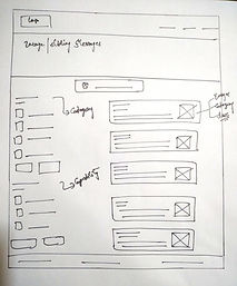
Structured the search results layout, focusing on usability with a simple project search bar and filter options.

Developed the functionality of search and filter options, to find relevant projects.

Added visual hierarchy and interaction elements for search results and filters, improving navigation.

Finalized with a clean, polished layout, intuitive filters, and improved visual presentation of search results.
THE FINAL DESIGN
After rigorous brainstorming, wireframing, and testing, it was time to bring our ideas to life in the final design phase. Here we focused on translating our validated concepts into high-fidelity designs that would effectively address the user needs and business goals identified earlier in the project.
HomePage
Old

New

The new homepage features a more user-friendly layout with improved navigation, enhanced visual appeal, and elements like the "Categories", and "Viewers and liked counts" sections. Floating feedback and demand buttons make it easier for users to interact and submit their insights or requests.
Internal Page
Old

New

The internal page includes sections like "Capabilities" to know about the project and "Related Documents" for discovering other projects within the same category, improving navigation and engagement. Added a custom comments web part allows for better collaboration, with email notifications triggering for relevant team members.
Search Page
Old

New

The search page offers an intuitive searching experience and filter functionality, helping users quickly find relevant projects. The visual hierarchy and filters on "capabilities, categories, and modified dates" make it easy to navigate search results, ensuring users can access the information they need efficiently.
IMPACT
Positive feedback and appreciation
25%
increase in client satisfaction scores, highlighting the effectiveness of the design.
30%
increase in successful project matches, leading to more business opportunities.
40%
reduction in the time taken to find relevant projects, improving overall usability.
Learnings & Takeaways
-
Technical Proficiency
Enhanced my skills in SharePoint Online and out-of-the-box web parts, and learned how to maximize their potential for efficient and scalable design.
-
Collaboration
It was my first project working closely with engineers, senior designers, and Business Analyst, where I learnt about teamwork and improved my communication skills.
-
Presentation Skills
Learned how to present confidently and effectively to a large audience, improving my ability to communicate complex ideas and receive feedback.
-
Project Management
I learned about project management skills by coordinating multiple design iterations and pay more attention in managing timelines to meet project deadlines.